The Language of the Designer
Notes
on Will Burtin, Editorial Designer.
Each year an editorial designer addresses the course on aspects of the
basic language of design. To supplement this live experience, we offer
the example of Will Burtin whose work is well known but deserves to
be better known. Here is a series of ideas and themes.
He wrote in "Design and Communication" in G.Kepes (ed) Education
of Vision, Braziller, NY 1965.
"Our cultural heritage has been immensely enriched by a vocabulary
of communication devices of well defined recognition values, be they
shapes, colours, letters, signs, songs, music, or line drawings, paintings, sculptures,
even certain aspects of architecture. In addition, technical innovations have
been introduced during the last hundred years - mass printing, photography, the
film, television, electronics, to name only a few - which have brought an entirely
new range of creative possibilities to express thoughts more efficiently and
to influence more people than ever before in history."
For Graphis No 22, Will Burtin and Laurence Lessing
wrote "Interrelations", pp108-122, on their experience of
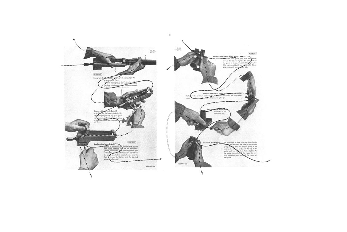
preparing pages of a US Army Air Forces training manual;
" Each aerial gunner had to learn his gun's mechanism inside out
in the shortest possible time. Consequently the message had to be direct
and swiftly to the point. A movie was considered for the purpose but tests proved
that movies had poor memory value in terms of detail, even in repeated showings.
Therefore a loose leaf manual was chosen, retaining as much as possible of cinematic
techniques....photographs were silhouetted so as to bring out detail and interpose
no square halftone blocks in the visual stream. Titles were pulled out of the
textblocks, set bold to facilitate an easy visual grasp of the subject, but set
no larger than the body type to avoid disrupting in the sequence of operations..."
In Graphis No 27, 1949; Will Burtin wrote further of "Integration
- the new discipline in design".
Visual communication is based on four principal realities
the reality of man, as measure and measurer
the reality of light, colour, texture
the reality of space, motion, time
the reality of science
"Man is the total sum of his experience. His scale and focus change
continuously as he studies, grows and develops. Therefore, in designing,
we must realise that steadily changing conditions confront us, to which we can
only adjust ourselves by : constantly developing better and more precise ways
of expressing ideas ; investigating anew with each new assignment the entire
range of approaches; understanding the mechanics of vision....Understanding of
space and time relations is a main requirement in visual organisation. In printed
design, images are superimposed on paper surfaces. The spaces inside and between
letters, between lines of type, their relationship to illustration, are vital
factors which determine the eye's access to basic information.
As we read from left to right, a flow develops, which must be utilized
to connect the various parts of a message, text and illustration. This
movement can be accelerated by keeping type faces and spacing open ,
or slowed down by condensing them. Thus reading time is as important
a measure as the space within which visual communications are organised.
In exhibitions, the adding of a third dimension plus physical motion
allows full employment of the senstions of timing, scale, structure
and volume. In motion pictures, time can be condensed (one year = one
minute) or stretched (one second = one hour) and the visual image (space)
can develop from realism to illusions of astonishing depths and dexterity.
In stroboscopic images, motion collapses into stages ; Time and Space
melt into one single unit....
The designer stands between these concepts, at the center, because of
his unique role as communicator, link, interpreter and inspirer. He
deals with their known qualities and quantities, discoveries, processes,
ideas and their effects upon each other. Through unceasing comparison
and interrelation of factors, he gains an understanding and exciting
insight into their nature and value, enabling him to depict even that
which has become invisible. Thus he creates. To enlarge and define this
vocabulary of visual language, and thereby contribute towards integration
of our culture, is his social responsibility as a man, as a designer...
Astrophysics and American Bazaar were parts of portfolios designed
for FORTUNE magazine. Each stands for a different subject, resulting
in variation of art treatment and composition. An important consideration
in art direction is the integration of such units within the larger
body of the magazine. This process of integration compares well with
a movie, or with three dimensional exhibits, which also have a wide
array of sensations, such as fast and slow speed, rise and decline,
staccato and smooth flow, noisy and quiet colours, all organised towards
a harmonious whole. These experiences are indicative of the direction
our visual work is taking, which aims at human control over the at
present largely accidental effects of creative impulses."
OPINIONS
Ezra Stoller , architect, letter to Chris Mullen Oct 1984, "Aside
from his flawless sense of design and proportion, Burtin brought
to his assignment three new things; a rigid old world training in
typography and printing techniques; years of war work on military
gunnery manuals in which some fairly complex spatial concepts had
to be demonstrated to a lot of semi-literate people; and a whole
spatial vision of graphic design."
Hananiah Harari , artist, letter to CM Nov 1983,
"I recall Mr. Burtin as large in stature, somewhat portly, hair
gray and cut short, neatly dressed even when in shirtsleeves , wearing
bow ties speaking precisely and in a German accent. "
 Brochure
for A-D Gallery Brochure
for A-D Gallery
ANALYSIS.
"The American Bazaar",
FORTUNE Nov 1947.
A) 108 : text "A picture gallery of the chief activity of Americans
- selling things to one another."= Photo Hand.
B) 109; night sky and point of sale, Reno/Howard Johnson)
C) 110 : Assault on the Senses, packaging, signs, Thanksgiving Day
Parade, sandwich board men
D) 111 : The Aural Nerve ; barker, cigar store indian, tailor shop
sign, packaging`
E) 112 : the early peddlers; Dealer in Slaves, NY Evening Post June
23rd 1802, Sozodont
F) 113 : The Great Show Begins, Jumbo, Young American Hams, Planter's
Wife, Sapolio Knife Cleaner
G) 114 : The Coming of Age; racial images in the ads, Mennen's Toilet
Powder, Lackawanna Railroad
H) 115 : Leyendecker ad, Edison Mazda, Chesterfield I) 116 : Pea-nut
Queen and Drive-in Waitress, bizarre and lurid effects,"I nearly
fainted when I heard them whispering about me..."
J) 117 : Animals are Identifers Kool, Johnny Morris
K) 118 : Babies are Stoppers... so are Slogans
L) 119 : Home front, fine art, Dalia and vertes
M) 120 The Kiss Sells ; window fantasy, foot balm neckties, stockings,
and woman in action.
N) 121 " Eternal Female The greatest symbol in American advertising
was, is and always will be the face of a beautiful woman." Sequence
of other features in the issue
1. Editorial: Making the Free Market Free,Market 1948.
2. The Ubiquitous Buick
3. J. Walter Thompson
4. The Great A & P (American and Pacific Tea Co.)
5. American Bazaar
6. Whole-saling on Borrowed Time Ely & Walker)
7. Pepsi Cola's Walter Mack
8. Best-Selling Bendix
9. Does Distribution cost enough ?
FORTUNE STAFF
Editor in chief: Henry Luce; President; Roy Larsen
Editorial Director John Shaw Billings;
Art Director Will Burtin;
Managing Editor Ralph Delahaye Payne
Art Staff ;
Deborah Calkin,
Max Gschwind,
Alexander Semenoick,
Elsieanna Graff,
Jo Kimmel,
Jane Mull.
|