MAGAZINE PEOPLE, SCHENK AND ZUCKERMAN
I had already organised the Visual Achievements of FORTUNE magazine and shipped it to the States. Visiting the archive of the American Advertising Association at Fairleigh Dickinson University in New Jersey, I witnessed the advantages of the institutionally based archive - generating funds, the creation of funded posts, the possibilities of publication, attracting bequests, making local industrial contacts, the possibility of springing post-graduate courses from the unique resource, and an escape from the monotony of wall to wall academic management. Bob Reed, magazine collector and friend of Tony Petruccelli drove me there. Jim had been under the knife but, I found out later, discharged himself from hospital to meet me. I met Renee Weber who administrated the AAAA archive which was used occasionally by the industry as legal records and by Woody Allen for his films, leaving her time to edit the Journal of the Printing History of America. Jim was an inspiration for the rest of my life. He showed me a collection of Winsor McCay art work presented by a local entrepreneur of the Comic Book Industry. There were examples of European avant-garde graphic design, each in a custom made slipcase. The more was bequethed, the more his archive attracted the distinguished exiles. He took me off to a book shop in Brownsville, and shipped back my purchases with duplicates as presents from his University Library. The lesson was get yourself an archive and be known for it. Returning to the UK fired up , I discovered that after Philip Kleinman had finished editing each year’s World Advertising Review, the submissions were binned. So Tim Giles and I drove to Kleinman’s house and shipped the lot to Norwich. I then tried to sell the idea of a World Advertising Archive, where the industry world wide submitted its best, and we got the lot. I think we acquired another year’s depositions but the School was not interested but I had some terrific posters for the walls in my teaching area. The next initiative was promoting the study of the Twentieth Century Magazine, given the association of East Anglia with the Printing Industry (not least, Jarrolds of Norwich) . Again nothing could be achieved without product up front. Students in Graphic Design would bring back armfuls of Sunday Colour Supplements and discarded periodicals. Kati Majtenyi was one of thje enthusiastic regulars who gave us the basics.
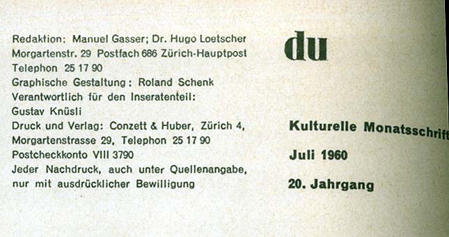
In this way I got to meet Roland Schenk who was invited up to talk to us. He had worked with Willi Fleckhaus on TWEN, designed classic numbers of DU. and had gone on to design the rebranded Campaign magazine for Michael Heseltine’s Haymarket Press. He was Swiss national, an elegant, courtly man,in blazer and cravat, who stayed the night with us before his lecture. Refreshingly, he could deliver for the client, any client, while his driving force was the decoding of esoteric visual symbolism.
While designing the July 1960 issue of DU on Jean Cocteau, he had stumbled on the layers of imagery beyond the standard meanings. Much of his working week was spent in the Bibliotheque Nationale. He talked about degrees of participation in the Masonic structures beyond common knowledge, and, in a matter of fact way, suggested that if he ever disappeared without trace, this dangerous knowledge was the key. I do keep checking, by the way. I had a decent collection of books he found interesting, including works from the East Anglian magus Shackleton. It was my first ever sale from my Library, carried in a large bag back to London. At a large fee, he was available to visualise and realise the magazine for whatever sector of the market you intended, but his heart lay in the emblem books, in the world beyond the popular esoteric. Oddly enough, he was familiar with the Norwich School of Art, having, for a period of weeks, being its Head of Design. I still have two copies of DU he designed, special issues on jean Cocteau and Henri Cartier-Bresson, ever fresh, ingenious and generous with photography on the page.
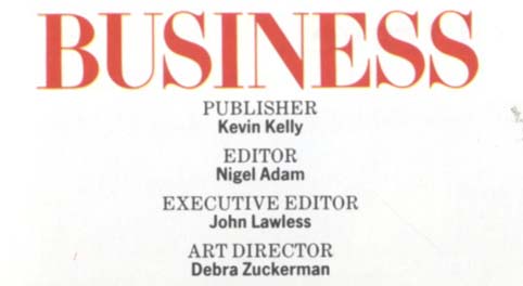
Because of my passion for FORTUNE magazine before 1968, I had an eye constantly looking out for a contemporary equivalent and suddenly I saw one on the news stands a Conde Nast publication entitled BUSINESS. The world of Industry was being treated as something for critical scrutiny and also clear exposition without macho fuss. An overall design language was applied by the illustrator Jeff Fisher, whom George Hardie admired. Articles about manufacture and services, people and finance were clever, beautifully written, and accompanied by specially commissioned photography and, most astonishingly, illustration by artists I had seen skulking in the margins of lesser publications going through the dreary ritual of the Signs of the Zodiac or Flags of all nations. Getting the back numbers, the art director was David Hillman of Pentagram, and then, suddenly, Debra Zuckerman. I wrote her a fan letter and sent her a copy of the FORTUNE catalogue I did with Phil Beard, and she came to give the Norwich a design lecture like no other, with clarity and understanding of what wee needed to know. She was, put simply, the most impressive professional designer I had come across in the industry, friendly, modest and yet insistent on what she wanted for a magazine. I remember her talking about the importance of the strength of the Back of Book, that an issue didn’t blow its ammunition in the first 60 pages and then peter out, with the inconvenient stub ends of articles at the front. Not only did she commission telling imagery but had a keen sense of whether it should be a photograph or painting/drawing. And she read the articles, and read them thoroughly before determined how they were to sit on the page. When much later riffling through the Tate Magazine she was responsible for I would lush about the sheer quality and fascination of BUSINESS. She would demur at the covers, claiming typographic covers had moved on. If I have the story straight, she had come over to London from New York. I remember her stories of her father’s experiences as a Political Radical in the Macarthy years. She had graduated from the London College of Printing, and had approached David Hillman for freelance work. He was about to go skiing, so, in an act of supreme confidence, hired her to design the thing while he was away. Her performance was so startling she designed the magazine thereafter, an inheritance that reminded me of Eleanor Treacy taking FORTUNE over from Tom Cleland.
APRIL 1986 Appointing an artist, Jeff Fisher, as an associate editor was a major step reinforcing the visuality of the thing. Accounts speak of its well informed and authoritative articles under the editorship of Nigel Adams turning out each month as a delight to the eye, in contrast to its main rival, Management Today (nicknamed Management Toady with some justice). I heard that Conde Nast, like Time/Life under Henry Luce, were prepared to take the financial hit caused by fewer than the anticipated readers but their partner in the venture, the Financial Times Group pulled the plug. I have a decent run of BUSINESS and am shocked little of it can be found anywhere on the WWW. Without the institutional sales that its rival enjoyed, it nevertheless persuaded a general readership that business was exciting, central to their lives, and far from a cold matter of double entry book keeping. That this was achieved with imagery and diagrammatics of the highest order was down to its art director. As a tribute to Debra then, and craving the indulgence of the artists, here is a selection from their excellent coverage of the last few years of the Thatcher administration. I exported an interest in Magazine design to Brighton where we set up a Research Assistant’s post focussing on the question, “Why does that magazine look that way?” a fair question, but one ultimately not resolved in any meaningful way. The sheer refusal to admit defeat, in the face of apathy, snobbery and the sheer bulk of the material strikes me as my being perverse. The only archival initiative that I found workable was the website The Visual Telling of Stories where the cost was minimal, the additions considered but personal, and the sense of authorship a reality.
|


BACK