Aside from team teaching of the highest order, the tutorials with dedicated and creative students were a daily pleasure. I had a generous pair of rooms with an office front and a windowless back room with file cabinets and banks of book shelves. There was a trolley with hi-fi and radio, and a pair of projectors on a wheeled stand. The studio was outside my door, in itself divided by a concertina screen, known as Old Sticky, as its rubber surface had perished into a semi-liquid state. The one computer was on my desk. At Norwich, the digital revolution was sorely restricted and confined to the aegis of John Cameron. At Brighton I expected a more equitable distribution, and indeed there were machines in each staff room. There was no departmental policy and until quite late in the day, no central resource. “Brighton is an ideas based institution” I was told, which was code for we admit to a lack of investment.
As I got more interested in multi-media possibilities, vital to the sequential of the Future, MA and then PhD students explored possibilities in exciting ways. Hype and academic flim-flam quickly overtook the realities of lack of investment in software and hardware. A conference held at Brighton startled the visitors as to how little we had to offer. There was a natural beginning with word processing, and then a tentative exploration of the digitalisation of the image. John and I anticipated the possibility of committing hundreds of thousands of high quality colour images to a single floppy disk, Lords of the Oceans of Images we would be. Dispiritingly we managed only five granulated travesties to a single disk. The optical disks were so expensive, the scanners clunky and intermittent, the software beyond any reasonable person’s pocket, so I had no hopes beyond those of the cheerful amateur. It didn’t seem to bother the Managers that our students were more advanced in terms of software and hardware.
It was my fortune that in the early ‘nineties I was allowed almost daily sanctuary at lunchtimes in the bookshop of Holleyman and Treacher. One of the two partners, David Plumtree urged me to get the hardware for home use and even bought our son Sam his first Mac. David, now free of the public and married to the artist Barbara Loftus, is well into movie making on computer, and Sam has his own computer business. Without David, I would simply have been a sort of Redcoat for the MA students, whereas I could add something with multi-media that no other tutor could provide.
A major difficulty in Higher Education (Design) was the reluctance of that generation of technicians to make the jump between Hot Metal and the New Technologies. The old certainties were seemingly no longer required, there was inadequate investment through art schools, and the applications available for the Mac Computer seemed to expand, and change by the week. Several old salts admitted relief at retirement in that they didn’t have to come to terms with this revolution. It was unthinkable that students knew more than they did, and were prepared to make this clear. Worse of all were those technicians whose power and authority were threatened to the extent that they adopted sphinx like poses to suggest they knew all along. This gave them the option of mugging up quickly before the next encounter. In extremis the pose of silence could be sustained indefinitely as the University went to Hell in a handcart, as far as the new Technologies were concerned.
The interview for the MA Course Leader had alerted the authorities to the existence of Rory Matthews who was duly appointed as supremo of the Digital, and there could have been no better helmsman. He was generous with knowledge, keen and able, with a default of cheerfulness and dry wit Other research staff appointed were not so forthcoming, guarding their territories nervously as they retreated into the dry image free world of the Binary. It was a mark of Rory’s career (and mine) at Grand Parade that rumours and asides circulated without any foundation, that we existed outside the Computer Infrastructure and were advancing our own causes outside Academe at Conferences and Workshops. I remember the disbelief on Rory’s face when he caught wind of this nastiness. Suspicions were generated easily among the computer Luddites. Various Top Dogs (including Tony Blair) regularly gave Key Note speeches at Conferences the World over on the New Technologies, without knowing how to turn the things on.
Click for my Norwegian Key Note speech 2002
Years later, the wheel had turned and we were expected to make an impact beyond Brighton University. Failure to score Brownie Points in the Annual Research Audit often took the form of a charge of provincialism. I remember being advised to deliver Key Note Speeches abroad (anywhere) because working on the world wide web lacked international impact. But I was struck how, given the paucity of debate with Top Management as to what we were doing in multi-media, received opinions abounded and envy found malicious form behind my back.
It seemed uncanny in that, wherever the University sought an enhanced understanding of the world around its students, it retreated into a dull world of theory several times removed from our students’ reality.
In the early ‘nineties the screen world was either the province of the Librarian or the Comic Book artist. The New Technologies offered instantaneous sifting of mountains of information, so attractive to Managers, particularly in the Spread Sheet (Excel) format. Seeking to counter this tedium, the younger set at the Uni took to the visual language of the Supermarket flier with lavish use of the Comic Sans font and a battery of patterned panels flashing in complementary colours.
Such was the nervousness confronted with these possibilities that, you were in one camp or the other – ponderous or flashy with little consideration of visual languages appropriate to any given body of thought. The problem was that students applying for our courses were well in advance of this institutional inertia.
I had always seen my lectures as interplay between the spoken word and montages of images, a dream stream so to speak. One of the Computer magazines, Mac User perhaps, offered a limited version of Director which allowed me to fiddle with ‘sprites’ on a ‘stage’. ‘Behaviours’ could, I was told, be attached to each sprite, either by writing a simple code, or dragging some lively action from a palette of choices. When I imported a musical track to this malarkey I knew how I would get through the next few years at the University. The later discovery of writing a website in html (hypertext markup language) was icing on this very sticky cake.
still from The Nightmare Song, an animation after
Gilbert and Sullivan
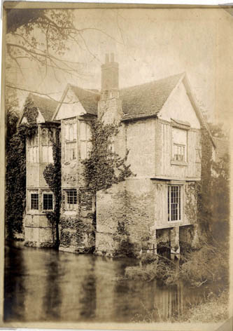
The aesthetic and technical factors in the study of the Sequence merged seamlessly with Multi-Media work on computer. It could start with a simple montage where the transitions (chosen from that palette) could be, say, slow pixel dissolve. There were infinite possibilities in importing sampled sound and clip art of ticking clocks and tolling bell. It was just amazing that I seemed to be the only person taking this forward. We duly adapted our Mission Statements with grandiose claims of imaginative achievements in the medium. I started with some scans of an East Anglian moated house darkening in the twilight to some sinister bits of overlapping Shostakovich, and the world on a screen opened up for me.
Somebody believed in me because I was given a year’s sabbatical to explore this further, without too much commitment of what could be achieved. The glory of it all was that there was money for outside assistance (Paul Gammon the architect for rendering of complex shapes and movement; Tim Howarth for composing sound and music). The presiding genius was Jackie Batey who I had encountered as a student on BA and MA courses and who had exactly the right blend of technical curiosity and visual flair to help us forward.
It was never clear what the outcome was to be. Too many such projects in art schools deteriorated into extended holiday breaks and the opportunity to wash the car. I wanted accountability and had eventually several opportunities to show the material to the people, and to the students in particular. It was called The Art of Light.
I wanted the project to be heavy in content and characteristic in shape. I didn’t want it to rival the flashier interfaces, predominately influenced by Silicon Valley where every letterform was cast from a chamfered alloy, and because of its ray tracing, gleamed as it turned pointlessly in limitless space. I was too old for that incarnation of the Geezer at the Keyboard with his peaked cap on backwards. I knew it had to test the correlation between icon and information revealed in a way that several of us had discovered in Frances Yates, The Art of Memory. What better than to explore that moment in European culture when image and text were conjured forth in Memory Theatres.
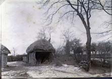
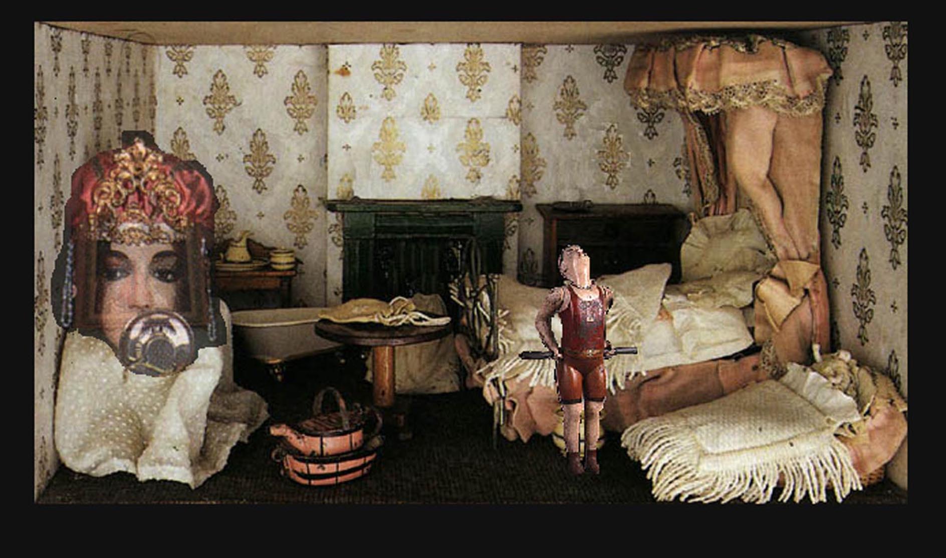
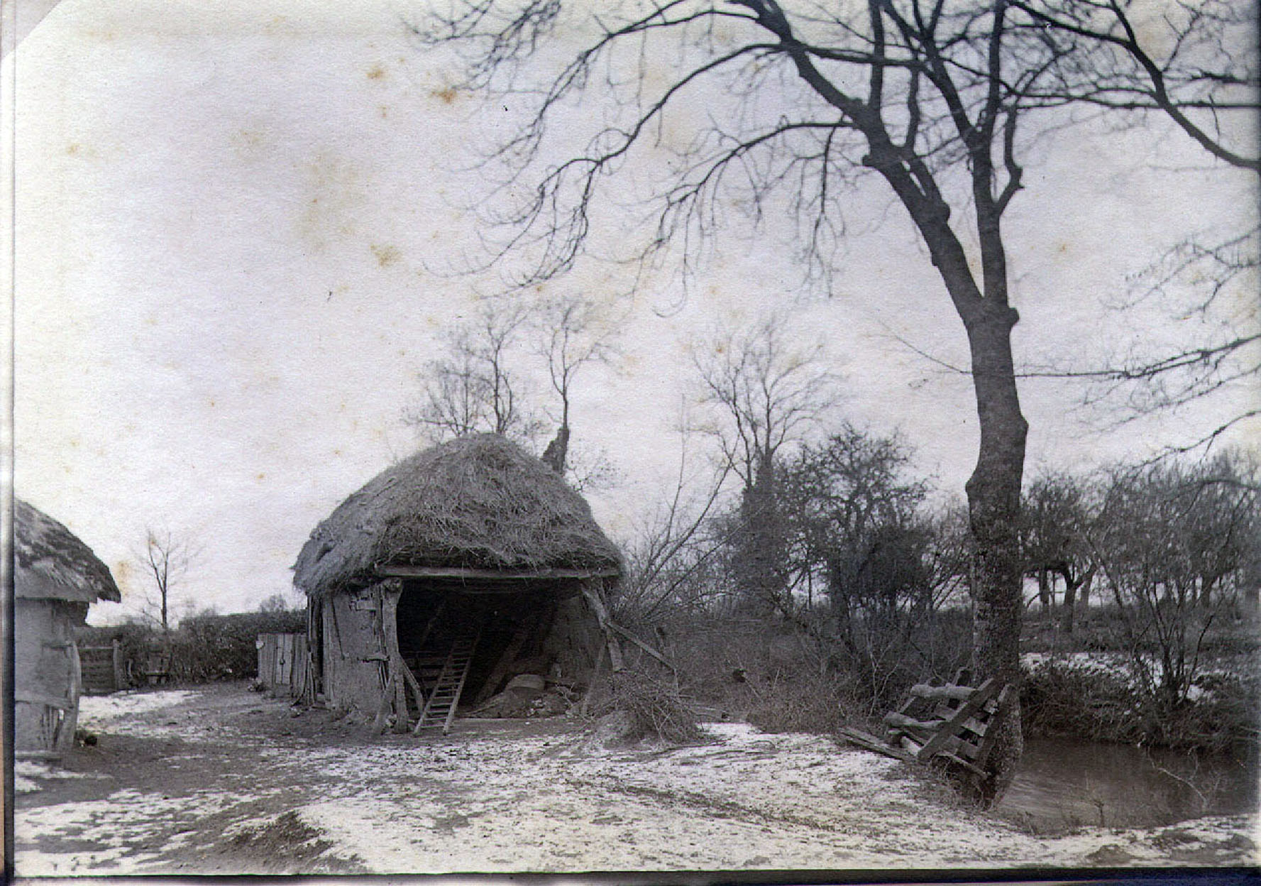
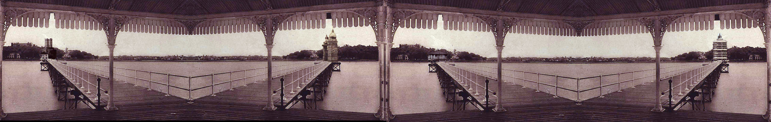
During my MA teaching I had developed a series of three hundred and sixty degree simulated landscapes on disk. The viewer could track left or right, all to an embedded ambient sound which gave an aural perspective to what you were looking at. At a Show and Tell, the audience gathered around the single screen. Students often brought their kids to lectures and presentations. The following week I was told that one child had had nightmares after doing the tour round my inundated landscape from a dark barn to an abandoned house. A sombre bell tolling in the distance was enhanced when the cursor explored the barn’s interior and a soft miserable groaning was activated. The landscape was inspired by a phrase I found somewhere, “there is water under the earth’ which still sustains my work on Grammercy Park.
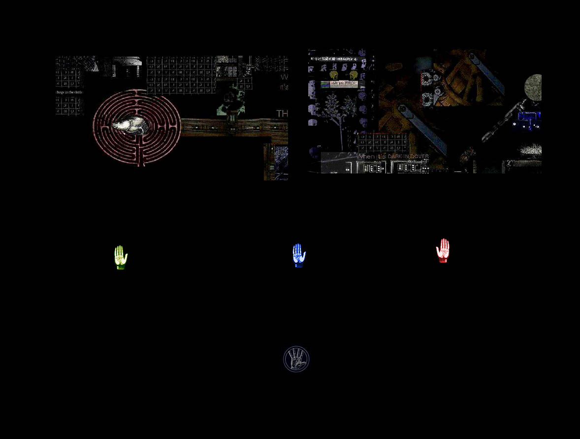
THE ART OF LIGHT
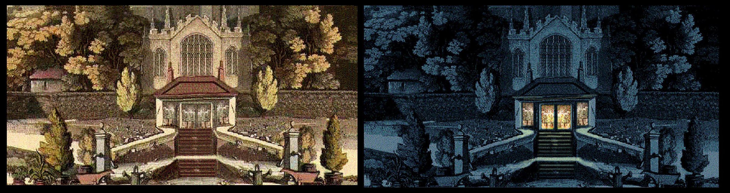
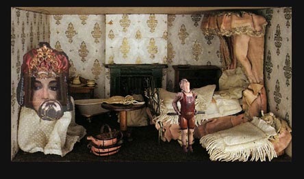
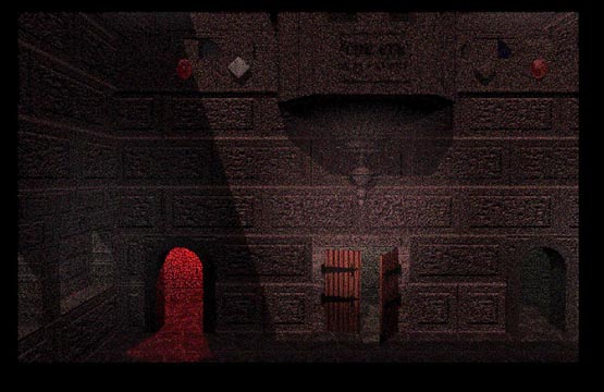
The initial interface, the threshold for a journey through data was a three dimensional simulation of of Robert Fludde's Memory Theatre from Ars Memoriae, the Theatre of the World approached from the Great beyond and seen in a turning sphere, modeled by Paul Gammon. The Square and the Circle are reconciled (pace Marvell’s Upon Appleton House). The Spectator descends to the interior which is at first viewed from a height - a privileged view. It was not made clear but the Visitor can look around this 360 degree simulation and is aware of locational aids to gain access to various bodies of information. Barely perceptible lights flicker in windows and doorways. The door to the Labyrinth beckons in an unpromising way.
Once the space has been understood by being traversed, there is an option that crystalline columns can be activated, and the true function of the Theatre (beyond the Aid to Memory) is revealed by shimmering animations of form, light and colour, in demonstrating the path to the Transcendental by means of Light. Throughout the exploration of the Theatre, each visual proposition is accompanied by its aural equivalent.
There were presiding presences in each zone of knowledge, but their exact identity need not be known. Over and over again I encountered subsequently instances of authors and artists seeking to embed specific information in visual locations e.g. Rudyard Kipling, Something of Myself (first published in 1936) "My office work had taught me to think out a notion in detail, pack it away in my head, and work on it by snatches in any surroundings. The lurch and surge of the old horse-drawn buses made a luxurious cradle for such ruminations. Bit by bit, my original notion grew into a vast, vague conspectus - Army and Navy Stores list if you like - of the whole sweep and meaning of things and effort and origins throughout the Empire. I visualised it as I do most ideas, in the shape of a semi-circle of buildings and temples projecting out into a sea - of dreams."
The overall effect was magical and proposed a body of information in visual form that could be established, manipulated to enhance the capacity of the human mind to store information in a creative way. This principle lies at the heart of the study of Sequence, and later was the fundamental proposition that lurked at the heart of the Studio based PhD. It was difficult to get those responsible for higher awards to understand an approach to advanced work that was not logocentric.
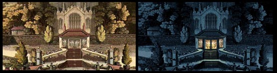
One section that delighted me in particular was to move the visual culture on from the seventeenth to the eighteenth century and confect a continuous landscape from depopulated aquatints by Thomas Rowlandson for The Dance of Death. Without the leering skeletons and oppressed humanity, there emerged a consistently dreamlike location of landscape, seascape, riverbank, and above all the Garden. Jackie was able to trigger a sequence whereby (with due reference to Marvell) the Garden in the Afternoon could slowly turn into the Nocturnal, with some evocative ambient sound devised by Tim. That printed speculations on the nature of Light could be found embedded therein, was magical.
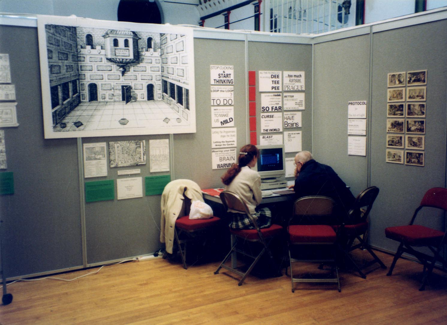
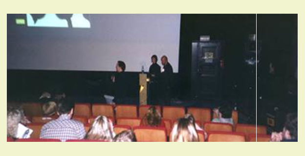
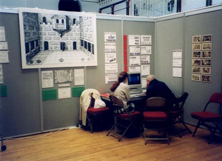
Macromind Director, even in outdated versions on disk, could be manipulated into purposes not anticipated in the Manual. Jackie Batey was delighted one day when she realized that three lines of code containing +1, then +2 then +3 could make three planes of imagery move simultaneously at three different speeds. I go into more detail here than you’d expect because nothing came of The Art of Light beyond a one-off day presentation at the Cornhill in Brighton. Oriole, Jackie and I faced a curious public at a Postgraduate Day, and generated much interest, not least among colleagues from other departments and campuses of the University of Brighton. The goading rhetoric on the display screens was based on Wyndham Lewis’ BLAST. It was a deliberate attempt to identify our multi-media work with the visualization of concepts.
At the end of the project copies of the disk were circulated among the University hierarchy. There were many polite noises but little action. I found out later the project had become a power struggle between the Top Dog and the Middle Dog, testing to see who could be pressured into paying for it. Every now and then I find a long lost folder on the desktop bearing the shards and threads of The Art of Light.

click to enlarge
MEETING THE WEBMASTER
I had learnt enough about Macromind Director to know what I was looking at, while I concentrated instead on learning how to express myself in HTML in creating a website, initially for the MA students. A new Head of BA Graphics saw me as a disruptive agent in his midst and told me he was getting me to supervise the undergraduates’ essays. Although he was demonstrably rather dim, I wanted there to be no misunderstanding. I gave that stuff up in Norwich and I had no intention of doing so. Many months later he came oiling back having realized his students were consulting me on an ad hoc basis on html coding and Director Lingo. By this time in my University career I was not susceptible to the blandishments of the Dolt, but I did agree to a session for all Grand Parade undergraduates, trying to show how they could make their own websites as part of Career Development. Maria Short helped and inspired me, but workshops for over 100 students at a time were not feasible.
The attractions of a website for part-time BA students were obvious and I loaded our research information on a external hard disk connected to the University server. In contrast to the University’s site, we managed to have images embedded in the text, and the response was most encouraging. The images were clean in terms of copyright, the text scholarly, the timetables exact. But eyes beyond were looking on with some alarm.
Somebody purporting to the University’s Webmaster contacted me with his concern about what we were doing. He turned out to be a slip of a lad, perhaps no older than my son, who tried to explain that more text could be loaded on if we had fewer images. I protested the reverse so he switched his attack to criticize my leaving gaps in my html coding, filled by an unsightly automatic default of ‘20%’ on screen, This seemed to him an affront like no other, but I didn’t forget the lesson. His sickly pallor and dull gaze return to my mind whenever I leave that gap.
The impact was making itself felt. The Head of one Department at Grand Parade department burst into my room. Did I know that people outside the United Kingdom were looking at my lecture programme? “Canada..: he said breathlessly, “Hong Kong… it’s amazing.” The basis of the my MA site was so different from the Yellow Pages look of the University site, that there as bound to be trouble sooner or later. I had wanted the website to feel more like an Illuminated Manuscript than a Modernist Tract or even Corporate Pronouncement. I wanted a default font size greater than 6 point, and above all I resisted gratuitous animated decoration intended to seize the attention of passing budgerigars. The Top Dog uneasily showed me an American criticism of my site being “badly designed”. My critic’s own site was conventional page with hot links where the text became obscured by its own vivid colouring the more you used it.
Enough said. Very soon the external disk of my website mysteriously expired and a replacement refused to work. In advance of my leaving I screen grabbed the lot intending to start again. Recent accounts of the University’s attitudes to outreach and archiving have not reassured me they have grasped the power of multimedia on line, beyond the ultimate creation of a mere presence that covers their ass. I still have a huge folder of documents drawing their attention to everybody that mattered, without a single response.