THE STAFF HANDBOOK
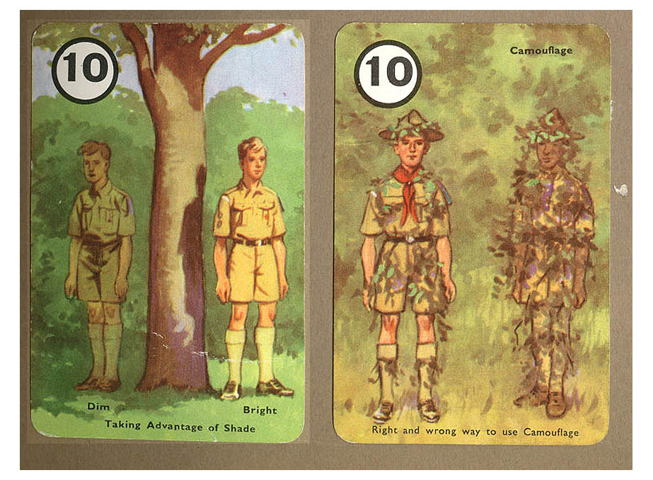
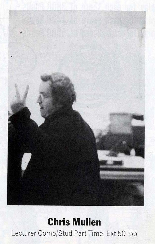
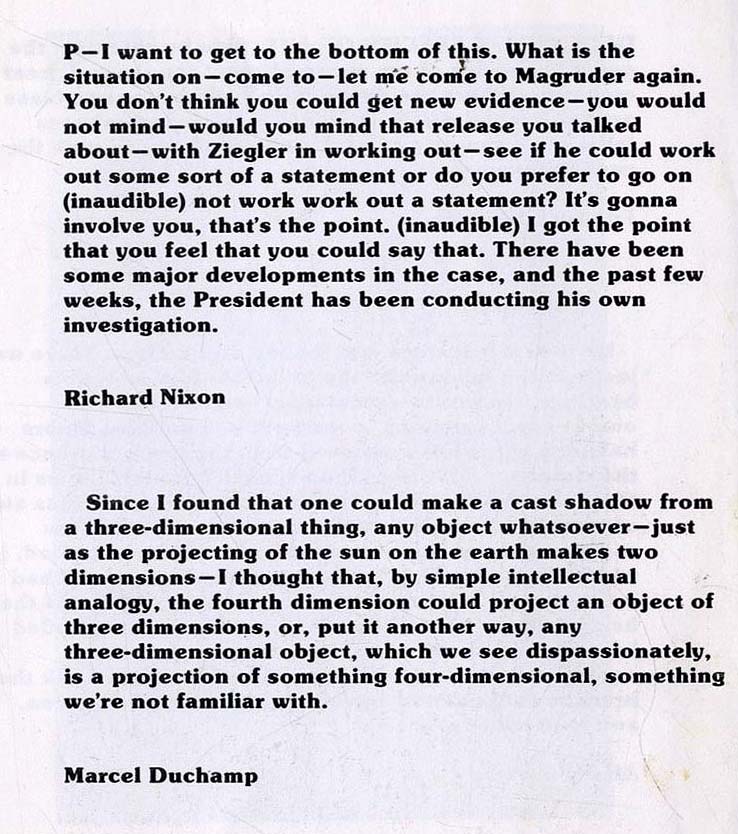
In 1981 the Head of Design at Norwich Bruce Brown had made a small paperback book with essential information for first year students. Each member of staff was asked to provide three pages of texts they held dear, to which was added a portrait of the tutor taken knowingly or unknowingly. Poor Richard Denyer, my great and enduring pal, was caught ruminatively adjusting his nostril. Whereas David Beaugeard went in for the Male Model Approach. I notice that George Hardie's portrait had been cropped to suggest a full head of hair. One afternoon teaching in the studio I was aware of a cloddish student circling me surreptitiously with a camera. With an appropriate gesture, I signalled I was aware of this tomfoolery, but was not going to stop the teaching to pose. With what must have been great please Bruce chose this image to represent me. I think Bruce regretted the publication, limited to 32 copies. If nothing else it reminds me of the hugely talented Ivy Smith and Robin Bagilhole. In retrospect it did represent self-puffery on a grandiose scale, and apart from the list of telephone numbers (which I see I was thanked for collating) I don't really know what the first year students made of it. Perhaps the foppishness and bragadoccio revelations of the photographs portraits at least warned them from whom they should refuse a drink. The texts chosen, and indeed the portraits, were hostages to Fortune. I would still chose the axes from the guttaral to the lyrical, the ordered to the chaotic, with a generous layer of Cloughian cynicism. One smart arse selected "isn't" and "he" "wonderful?" as his three pages, only to be punctured when they bound in the wrong order, that he wasn't wonderful. How clever of Bruce Brown. I wonder if he came to regret the choice of one text in his three pages, "It is not enough to allow dissent, we must demand it. For there is much to dissent from."(Robert Kennedy) Give me my due, I never quoted this back at him when I worked at Brighton, although the temptation was constant. I had first met Bruce on his first day as Head, when we both discovered the School was unaccountably locked up during the Vacation. Going for a coffee with him, I was quite candid what a corrupt place I believed the Art School to be. It could have been construed as bending his ear, but there was nothing I wanted from him. Later he brought me in to the Design Department to help with Project organisation and research on the studio floor, allowing me access to a higher and more satisfying level of study. "Better have you in the tent pissing out, than outside pissing in." This was further compounded when I was appointed to the MA course at Brighton where working with John Vernon Lord and George Hardie was so galvanising that I was more circumspect with the disposal of my bodily waste. At Norwich I developed a keen interest in magazine design and Bruce was then Art Director of CRAFT magazine which to this day I believe was one of the most superbly organised, elegantly laid out and persuasively illustrated of all post-War British publications. I know that seeing Bruce at work, and viewing the results, led me to study FORTUNE magazine and contact Debra Zuckerman, who was designing BUSINESS Magazine for Conde Nast. Every time I met Bruce's frustrated gaze over the Board meeting table, I had to remind myself that this was one of the finest designers of his age, swaddled in agenda papers, reports and spead sheets, like Robert de Niro's character in Terry Gilliam's Brazil. |
BACK


