DESIGN NOTES
| There is a largely unchallenged belief as to what a Website should look like - that there is a shape and expression that, once achieved, will empower -
My site holds to the following • large point size of assertive letter forms (no smokey planes of body copy, but blasts of hard text) • no clip art (fol-de-rols and twinky bits) • a clear distinction made between screen and printed page • a disregard of Gravity on the screen and a top heaviness that sways and lurches like Suprematism • location within a European design tradition and a studied disregard of American modes of putting things together • the information surface will be of stained glass, the Pauper's Bible.
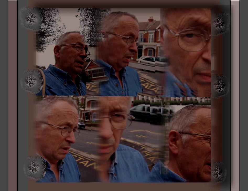
My problem all along is that I hate so many other websites for their appearence of gentility and fake elegance, their slow wittering release of uncertain information in electric blue 6 point chatter. Web designers are a bloodless brood. They emerged at the start from the Comic Book and then the Library Book- both groups averse to demonstrations of content. Professional Web Designers have turned out to be much worse than this, and much, much more expensive. If you wander The Visual Telling Stories you will encounter a daily changing labyrinth where you will be surprised, not just by the information and its juxtapositions but the very perversity of its visual propositions as they unfold - no elegance, no wheedling. Get this right. You'll need your wits about you.
|