


|
|
|
|
|||||||||
|
|
|
|
|||||||||
|
|
|
||||||||||
|
|
|
||||||||||
|
|
|
||||||||||
|
|
|
||||||||||
|
|
|
||||||||||
|
||||||||||||
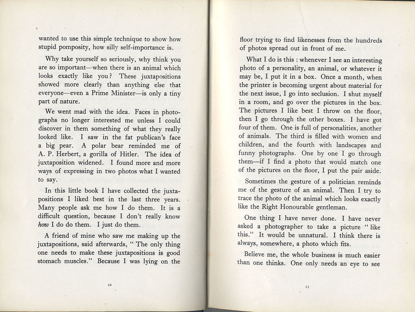
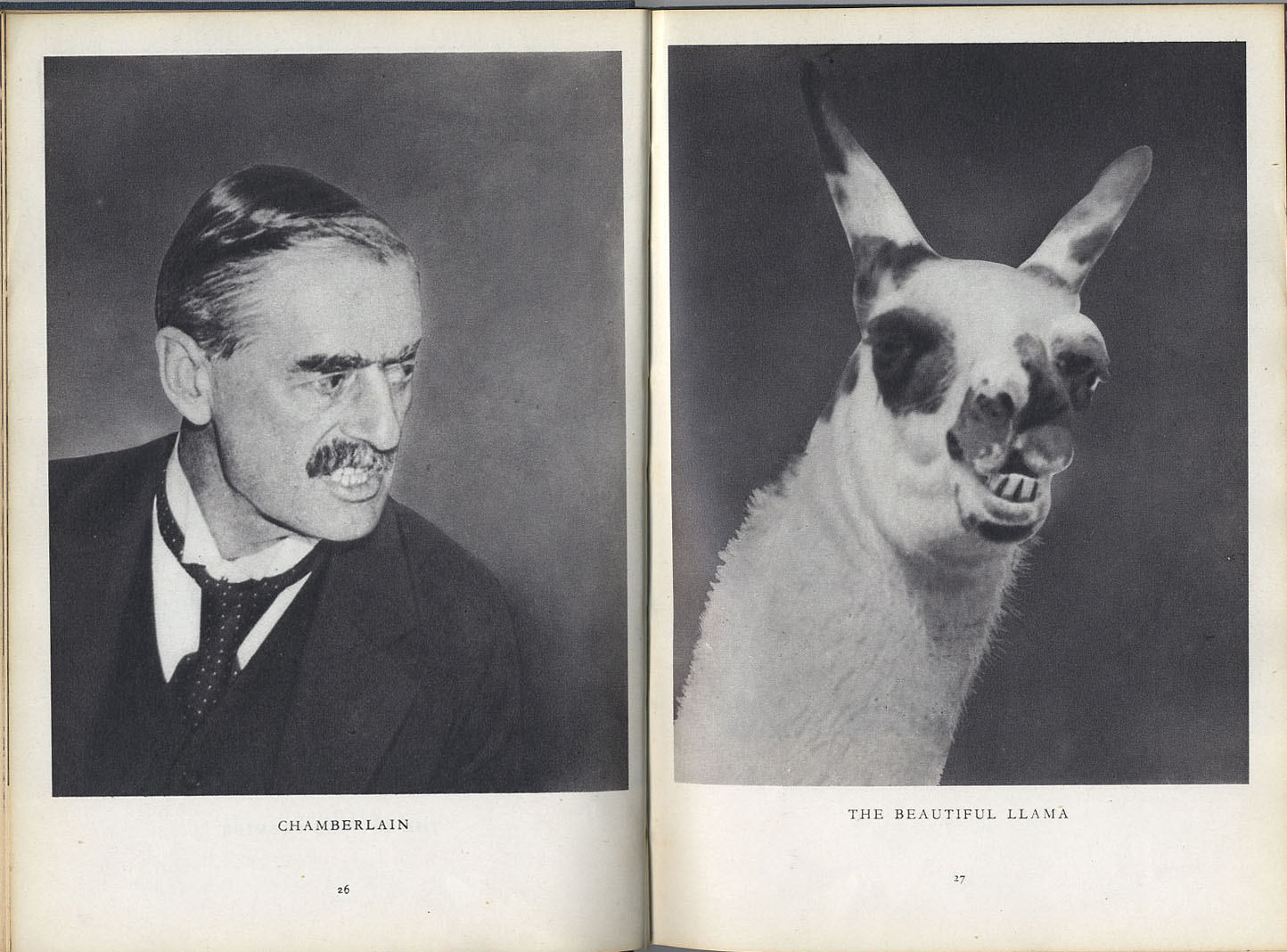
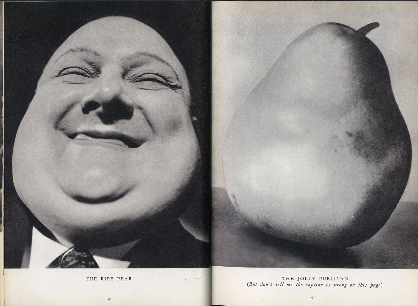
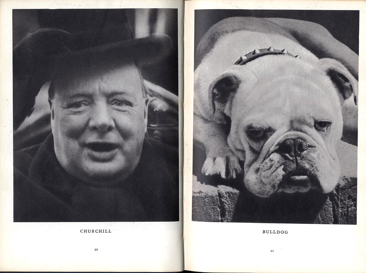
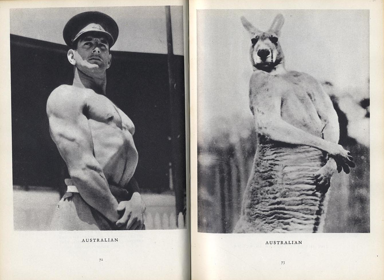
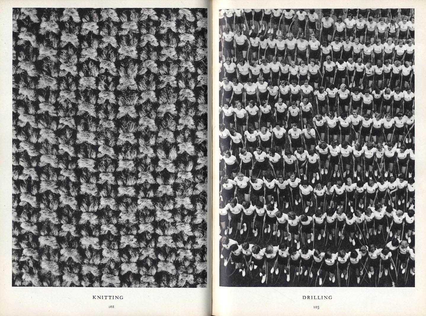
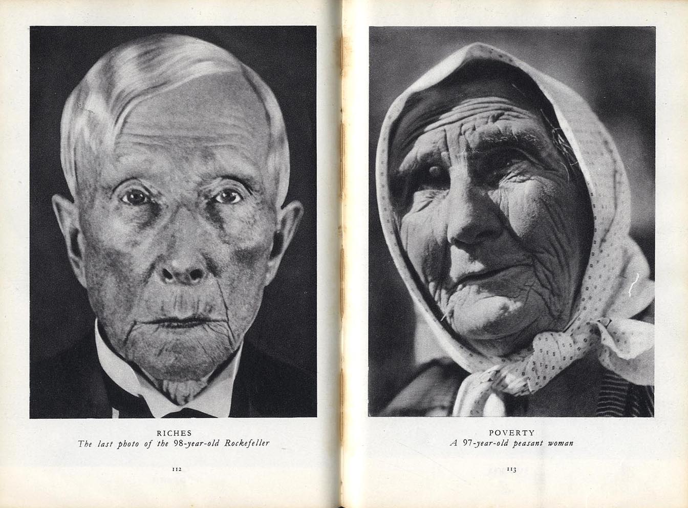
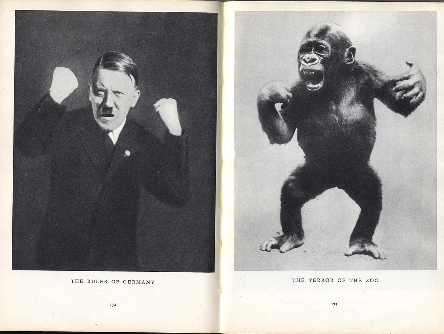
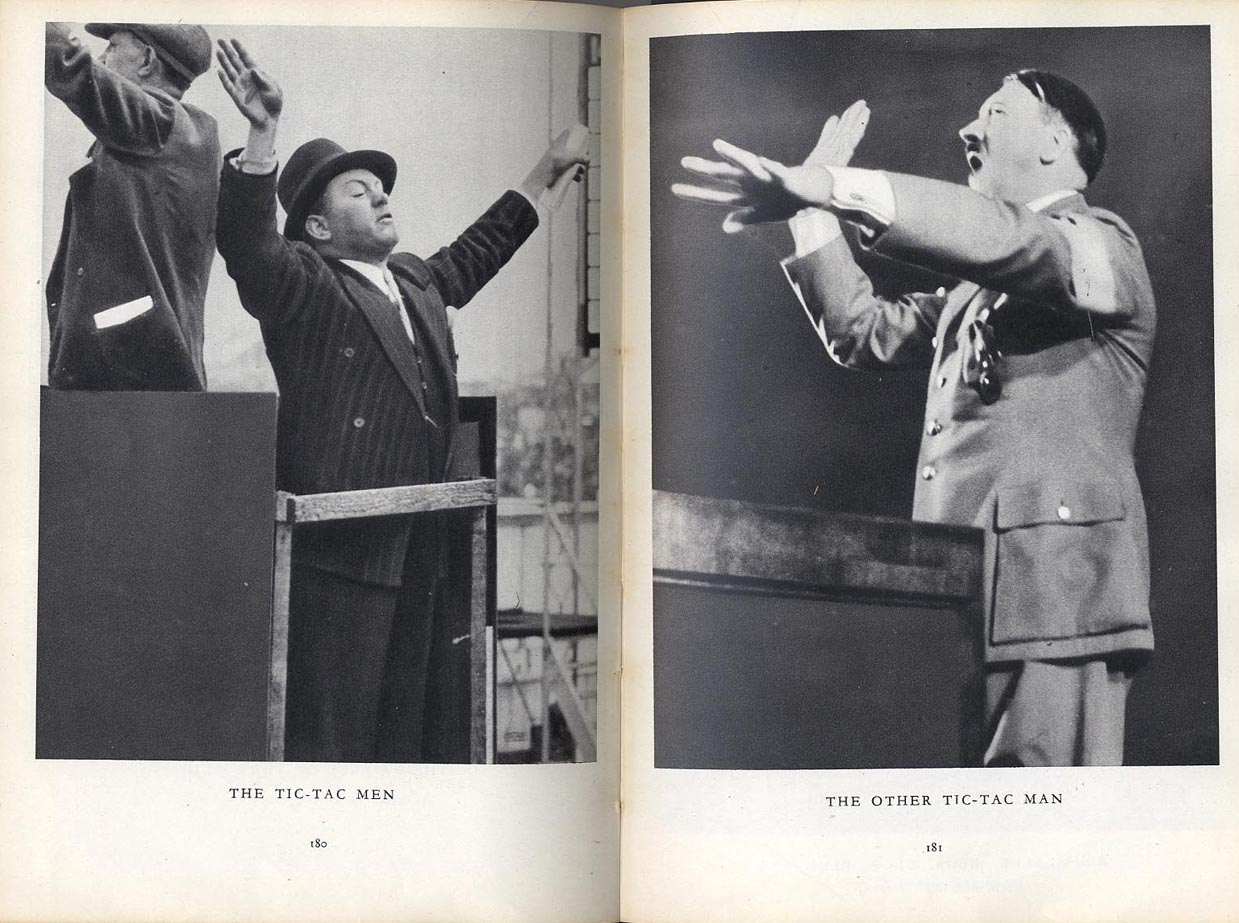
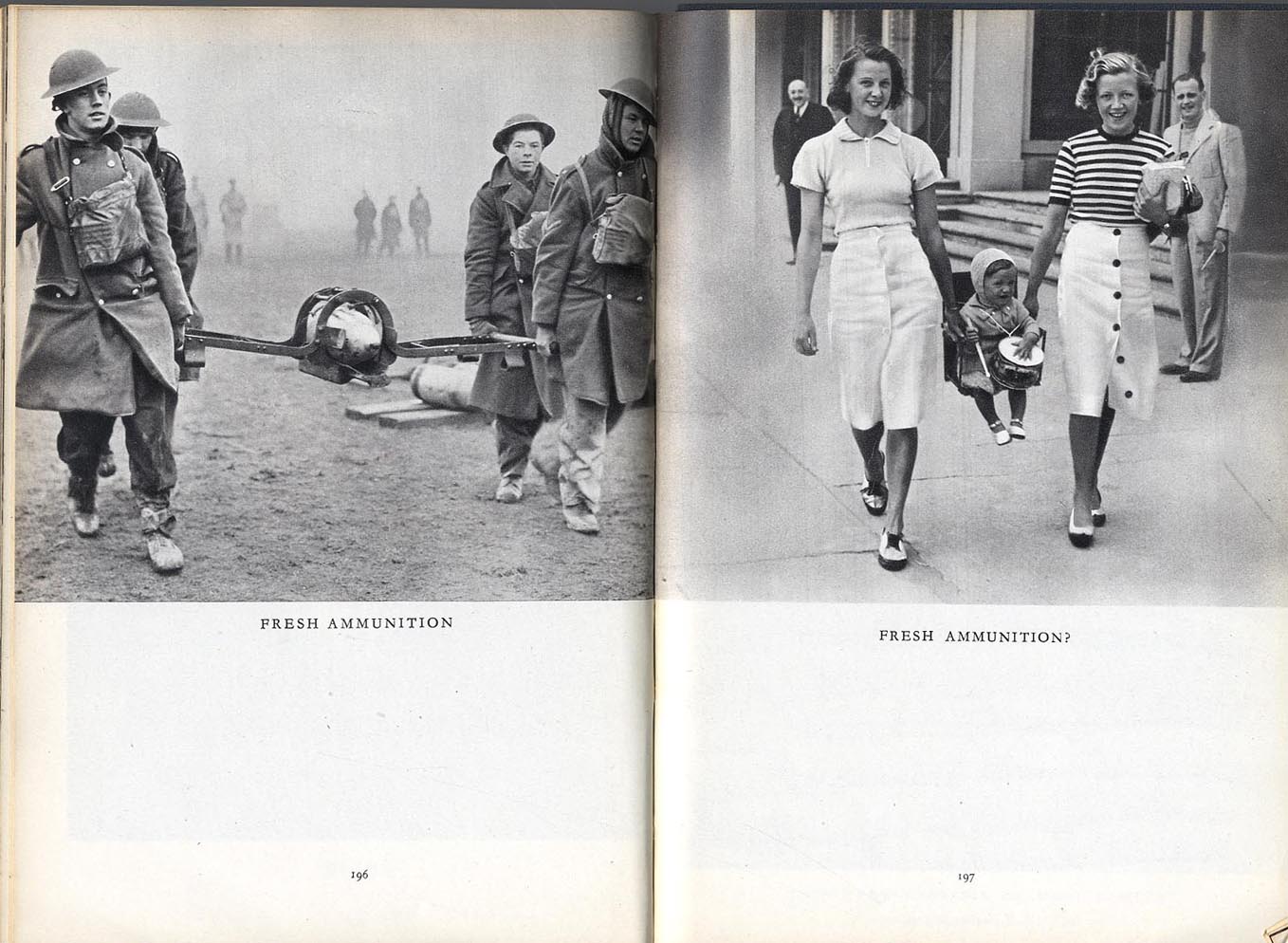
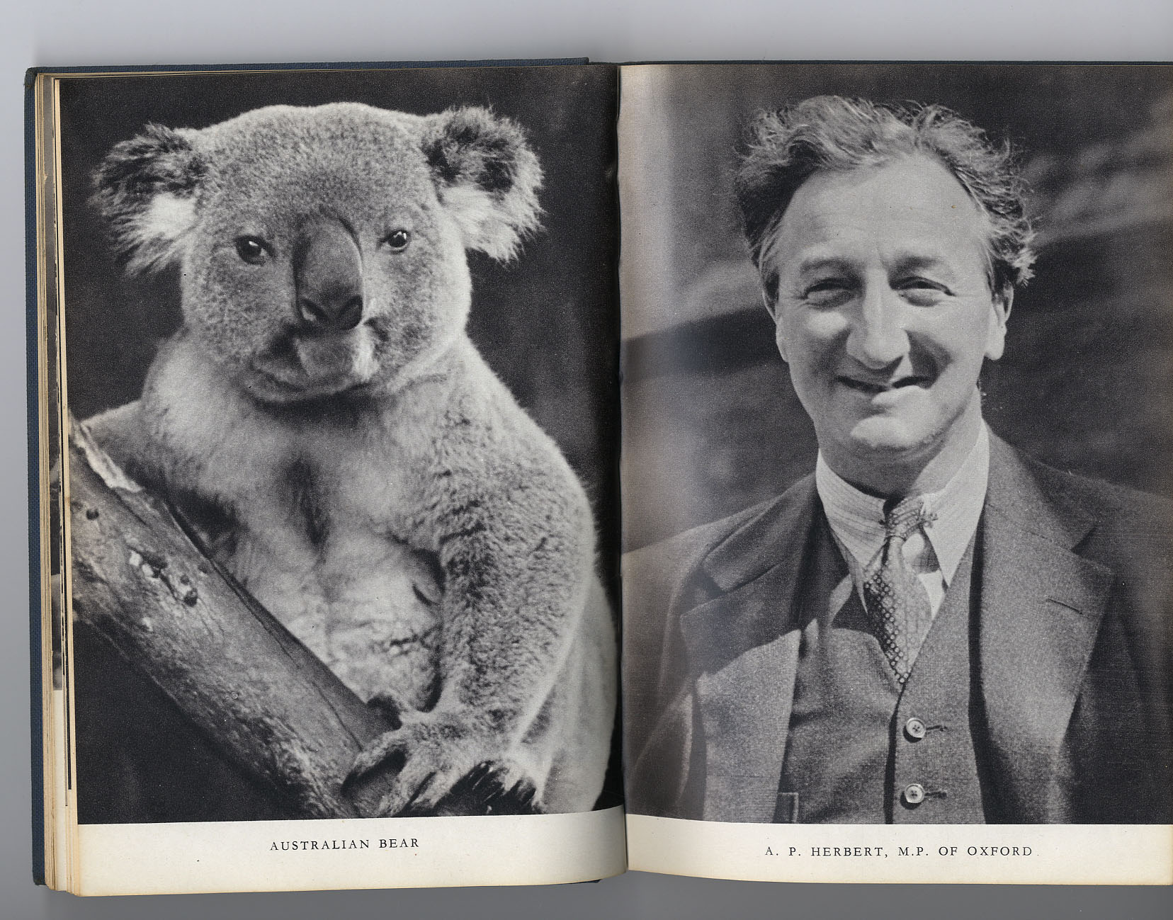
The book is rare. The text is precious. The illustrations are powerful. I risk putting the texts of the Introduction and the How to Write Captions in their entirety because they are so little known. The technique is an old one - juxtaposing human figures with animals in a satiric content.The technique is not unique in editorial design. Lorant did this as everything, so memorably. You have to imagine the small magazine (12 x 19cms) opening at the double page spread with no other distraction on the page. |