|
|
|
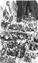
Moritz von Retzsch,
ANARCHY - 22 x 17 cms - a line drawing engraved, townscape, daylight,
the scatterings of citizenry attacking each other in a medieval german
town with a mindless violence - the economy of the production of the
image allows no light and shade and the artist has tired at the different
ways one person can thump another. Lacks a real sense of anarchy,
and becomes funny because it lacks imagination. I suspect he was more
interested in the architecture, and the other FAUST plates with fewer
figures are much more successful.
|
|
Crowds outside St.Peter's Rome waiting
for the Pope, photograph from Fulop Miller, and a variant to the milling
throng. I like the way the image can read a a series of bands of different
energies of crowd behaviour, caught between ranks of Swiss guards, a
band of figures (clerics ?) separating the clustered figures of the
crowd from the central focus, the Pope on his throne held aloft. The
colonnades of St.Peter's add a curved stress to the upper left of the
image. It can be read as calligraphic flourish.
|
|
|
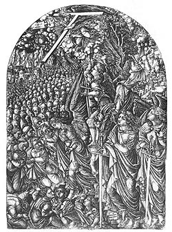
A highly eccentric and mannered rendering of the Crowd,
from Jean Duvet's L'Apocalypse figuree, Paris 1561; plate to
Chapter VI 30 x 21 cms a characteristic compressing of forms to create
the crowd, as a textured backdrop to the angels branding forheads and
a glimpse of the City beyond (right). A skilled depiction of heads swirling
into the composition creating flow and depth to the shallow spaces.
The head shapes merge with clous shapes and defy the scale of mountian
beyond. Duvet's Crowds are unique in the economic means of devices,
heads, hoods, crosses with a sustained mood of intensity and joint purpose.
|
 |
|
illustration by Gustave Dore to Balzac's Les Contes
Drolatiques Paris 1855, 8 x 11cms, an idealised and comic vision
of the medieval french town with turbulent movement, key incident and
sly invention. See also Dore's illustrations to Rabelais, and his graphic
responses to the Crowds of London 1872
Much use of plume, dress and sah to create a flickering
movemnt, and small notes of animals, one of which is pissing.
|
 |
|
illustration by Gustave Dore to Balzac's Les Contes
Drolatiques Paris 1855, 8 x 11cms, Crowd scene in battle, at the
siege of a medieval fortress -the Crowd of Soldiers becomes the collapsing
masonery, limbs almost cylindrical in armour. To the left an advancement
of dark knights act as a foil to the cascading figures.
 Go
to Dore's London Go
to Dore's London
|
|
| illustration
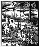
to Otto Nückel's , DESTINY, Marriott London 1930 - 10 x 11
cms - a novel in pictures, a bankside restaurant and dance floor with
the Crowd as spiky interlocked elements within the composition, using
more contrasts of black and white that the Sarg poster beneath. A contrast
between the landscape structures and the jagged rectilinears of the dining,
dancing crowd. |
 . |
| Tony
Sarg, Poster for London Transport, 'appy 'ampstead, 1913. A contneted
and amused crowd at the Fair (compoare with the next image) a controlled
composition with the crowd acting as pointer to the respective booths,
- solid here - rushing there, with the clear outline drawing style allowing
legs and arms to be used as aids to direction. The crowd floats over a
Japanese style shadow free ground . Legs of military men act as a strong
visual focus. Subtle washes of slighter brighter yellows and reds. |
|
| Illustrated
London News, Sept.11 1926 St.Giles' Fair Oxford which the source proclaims
" a sedate and slow-moving English crowd" set against the hysterical
show biz crowds of America. The movement is indeed sedate but easing through
the avenue between the attractions. Compared to the Sarg poster above,
an interesting exercise of pictorial sluggishness, emphasising the role
of the illustrator to distill and select. |
|
|
Richard Doyle, "Ye Publicke its Excytement on
ye appearence of Miss Lind", from Manners and Customs of Ye
Engyshe, Mr Pips his Diary, written by Percival Lee, Bradbury and
Evans, London originally published in Punch. undated c1860 16 x 17 cms,
and typical of Doyle's dry line style, adept in massing the bodies while
integrating funny incidents and characterisation.Impressive the vortex
of figures compressing themselves into the theatre portals.
 comparison - find the 20th century photograph of a crowd greeting the
returning aviatrix then use ytour back button.
|
|
| James
Ensor, The Triumph of Death 1894 etching also known as Death pursuing
the People. in the spirit of Dore but with an extra edge of the macabre,
Ensor uses the upturned faces as helpless and befuddled repetiton of round
shapes pouring through the narrow streets (of Ostend ?) some figures teetering
on the edge of the mythic, with a separate cast of skeletons, much loved
by the artist as a shaping destroying force. Not comic but a pessimistic
take of the Spirit of Carnival.Ensor was enthusiastic about the differentiated
crowd, policemen, judges, toffs in different hats and uniforms, all together
advancing towards their Fate. |
|
| |
|