Born in Stockport in 1920, Leslie Wood was trained at Manchester School
of Art and became a freelance artist in 1945 with immediate success illustrating
the second of Diana Ross' LITTLE RED ENGINE series, THE
STORY OF THE LITTLE RED ENGINE for Faber & Faber. It was the
second in the series after Lewitt-Him's illustrations to her THE LITTLE RED
ENGINE GETS A NAME of
1942. Leslie Wood had shown his drawings to the publishers in 1943 and he
was responsible for the rest of the series.
The format is a familiar one - oblong pages with great possibilities
for the child in a vast panorama of imagery when opened out. The
variations of illustrative elements open to the editorial illustrator
are used to their full - e.g.
the rhythm of single and double pages,
pictures in frames and pictures against the white of the page
colour alternating with monochrome wash
the orchestration of opacity and transparency
This generation of books for kids (PUFFIN books, King Penguin books, Noel
Carrington at Country Life, Katherine Hale's ORLANDO series) made much
use of the lithographic process, drawing often directly on the lithographic
stone. Leslie worked with the Manchester printing firm of Jesse Broad.
Others worked for the Curwen Press in London, or Cowell's of Ipswich whose
Managing Director, Geoffrey Smith was such a pioneer of cheap and lively
books for children.
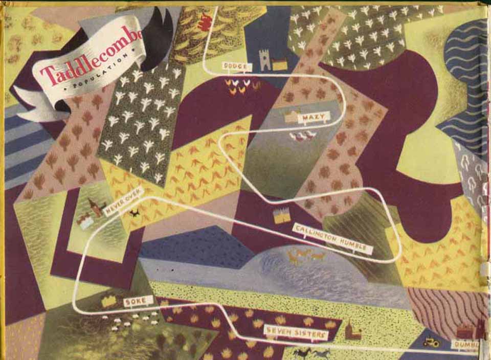
The Little Red Engine books are Leslie Wood in his natural element. He
uses all the rich possibilities of movement across the double page - railway
lines and ellipses for the eye. He was a smashing draftsman and never
lost an opportunity for tiny natural detail and visual jokes embedded
in the landcape. In the sections accessed beneath I have tried to show
how Leslie Wood manages to convey pace and variety in telling a story.
Particularly relevant is his world picture of the lie of the land - Taddlecombe
District where the Little Red Engine plies his trade.
Another successful title was WHOO WHOO THE WIND
BLEW for Faber and Faber
- printed by The Baynard Press in London.
His palette was a characteristic of the post war period - a subdued one
of tertiary colours, interspersed with beautiful monochrome wash drawings.
With other artists the intent was clearly an economic one, but Leslie
Wood was a master at the orchestration of olive greens and browns, greys
and oranges. In the matter of shape making he loved the patterns made
by manmade structures - boxes, rails and steps - as foils to human activity.
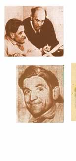
above - Leslie Wood and Clifford Carver - the team behind the Oxford
Colour Readers and Workbooks.
|